< Previous Article Next Article >
Layouts
Rich Display Layouts are special types of widgets that can contain other widgets within them. Layouts are divided into one or more container sections. When necessary, layouts can also embed other layouts.
Simple Layout
The Simple Layout widget serves as a simple container (rendered as an HTML DIV element) to host other widgets.
At design time, the Simple Layout is represented by a dashed border. However, at runtime, the Layout border is not visible.
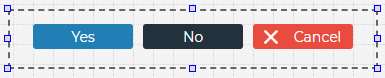
There are many instances when grouping widgets into a Simple Layout is convenient. For example, if you wanted to dynamically hide a group of widgets, grouping them together into a Layout simplifies the task.
Misc. Layout Widgets
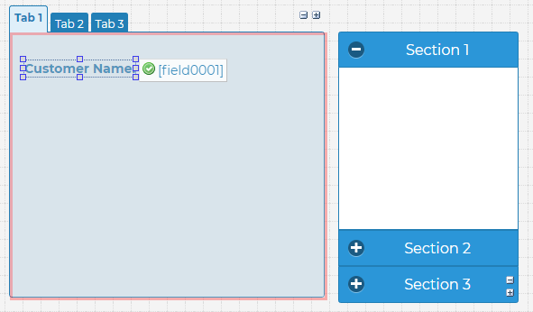
A number of traditional widgets, such as Panels, Tabs, and Accordions are implemented as Layouts. This means they can host other widgets in addition to providing their own core functionality.
Responsive Layout
The Responsive Layout widget allows you to rearrange your screen content in response to difference Web and mobile screen sizes. It is based on a Web standard called CSS Grid Layout.
Here are some resources that explain the CSS Grid Layout in more detail:
- https://developer.mozilla.org/en-US/docs/Web/CSS/CSS_Grid_Layout
- https://www.w3schools.com/css/css_grid.asp
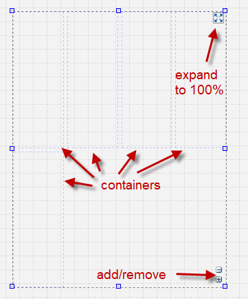
Rich Displays allow you to setup a CSS Grid Layout visually in a point-and-click manner. When you first add a Responsive Layout widget to the canvas, you will see some default containers.
Double-click the Responsive Layout widget to open the Responsive Layout Editor.
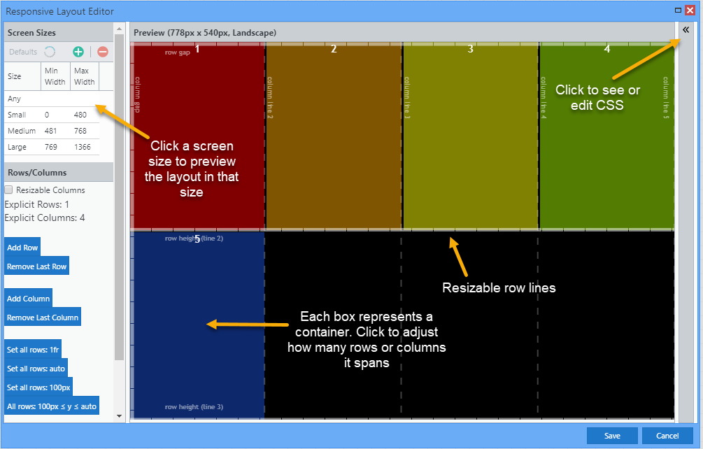
You can now adjust container sizing and positioning for each screen size. Here is a quick video that shows the Responsive Layout Editor in action:
Mobile Layout
The Mobile Layout provides convenient sections for an optional header, an optional footer, and content in the middle.
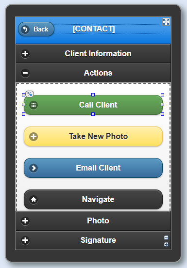
Table Layout
A Table Layout splits your content into uniform rows and columns. Each cell is its own container for other widgets.
Positioning with Layouts
Layouts make it easier to design applications that are responsive.
When you initially drop any element on the canvas, its position and size are fixed. But when elements are placed within layouts, they are positioned relative to their parent container, and this allows you to use percentages and anchoring.
Using Percentages
Widget properties relating to size and positioning can be set using percentages that are relative to its container. A quick way to start using percentages is from the Design Toolbar.
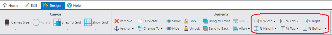
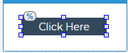
Once percentages are set, whenever your move or resize an element in the designer, the adjustments are made using percentages rather than pixel dimensions going forward. A % indicator will appear at the top of your widget to let you know that percentages are used.
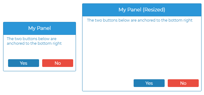
Anchoring
By default, element positioning is specified from the left and top sides of its container; however, there are times when you might want to anchor an element to the right and/or bottom. You can do this by selecting the Anchor option on the Design Toolbar.
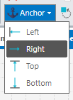
Once an element is anchored, moving it in the designer affects the position from the anchored side.
As the element's container is resized or rendered at different resolutions, it maintains its position in relation to the side it was anchored to.
Centering Elements
To center an element within a Layout container, right-click the element and select Center Horizontally or Center Vertically.
Expand to Layout Grid Property
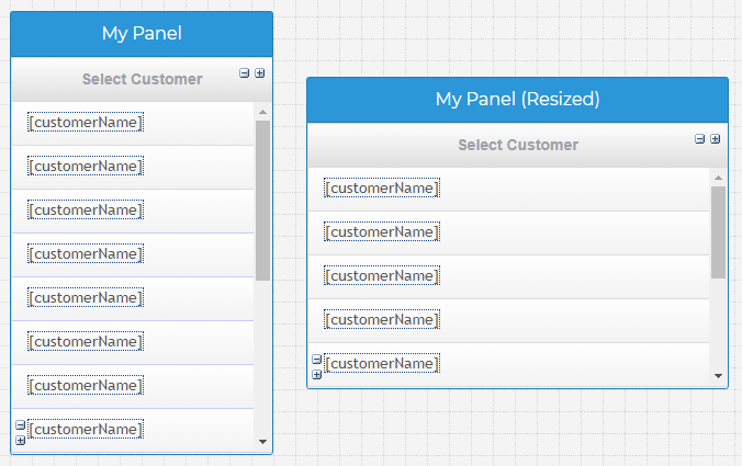
Grids are complex widgets because they contain multiple rows with cells that contain other widgets. If you'd like the grid to expand within its Layout container, make sure to set the grid's expand to layout property. This will automatically resize the columns and adjust the number of visible rows based on the current size of the grid's container.
Questions?
Have questions about this topic? Ask for help on our Profound.js Spaces Discussion Forum.