MR_Sample2
About This Space
test
Last updated on November 29, 2021
Public Permissions: View Open/Fork Modify Run Comment
Responsive Dashboard Template
This template illustrates database-driven components and the Responsive Layout widget. The application does not require any code or any routines. The functionality is built using the Visual Designer tool, which allows you to connect widgets, such as charts and grids, directly to database tables, as well configure responsive design for the page.
Database-driven Widgets
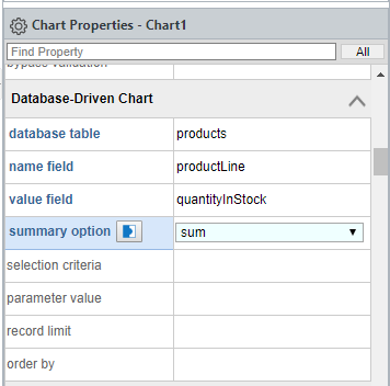
The widgets in Profound.js Spaces can be populated directly with database information through simple configuration. The connection to the database is established automatically.

Responsive Layout Widget
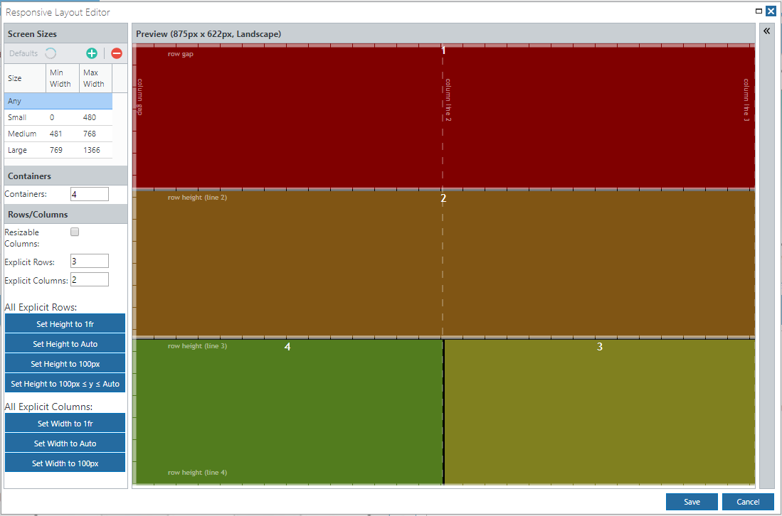
The Responsive Layout widget provides a visual editor that allows you to configure a responsive CSS Grid Layout in a point-and-click, drag-and-drop manner. The CSS Grid is a powerful layout system available for responsive design. In Profound.js Spaces, you can take advantage of CSS Grid Layouts without coding a single line of CSS code. To access the visual editor for CSS Grid Layouts, simply double-click the Responsive Layout widget on the canvas in the Visual Designer tool.

When you launch this example, as you resize the page, you will notice that the elements begin to adjust in size and eventually stack vertically as the page gets smaller. The Responsive Layout widget can be precisely configured for how and at what screen size(s) to reposition elements on the screen.
Be the first to comment:
Comments