Responsive Grid
About This Space
This space demonstrates how to create a more responsive grid using a layout widget and a little bit of JavaScript.
Last updated on July 3, 2019
Public Permissions: View Open/Fork Run Comment
Responsive Grid
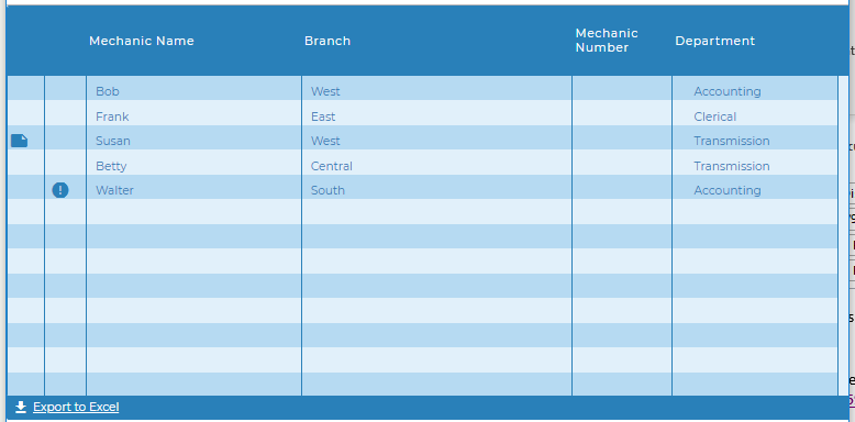
This project demonstrates creating a page with a more responsive grid through the use of simple container layout widget and a little JavaScript.

Simple Container Layout widget
Any of the layout widgets can be used to create the same effect but with various appearances.
In this example the Simple Container Widget was used to add the responsiveness without adding any visual elements, allwoign the grid to completely fill the screen.
The Layout is placed on the screen and then the width and height were set to 100%.
The Grid widget, in this case the Blueprint Widget Set Grid Widget was then dropped inside the layout and the property expand to layout was set to true.
In addition the paging bar was turned on, adding the page number and export button.
The Grid
The example uses the BluePrint Widget Set Grid but any grid will work including the Mobile Grid. The important things are to set':
- expand to layout to true
- hide columns option to true
It will be more obvious that the height is adjusting properly if you also turn on the Paging Bar at the bottom. There are a number of properties that will turn on the bottom bar including show page number, show paging controls, and export options. But you can also turn on the bar itself with no other options by setting show bar to true.
The JavaScript
A JavaScript function was added to the OnLoad() event of the Main screen and is an event listener for window resize is added to call the function anytime the window is resized.
The setColumns() function uses grid apis to hide or show columns based on the pixel width of the window. Removing columns when the width gets smaller give you control over which columns are still visible as the grid is condensed and enables you to keep the most important information visible and readable.
Columns are numbered from left to right starting at 0. Columns will retain the same index id even after other columns are hidden or rearranged by a user (in the case of movable columns).
Because the grid will do it's own resizing some trial and error may be needed to find the best pixel widths to remove columns.
window.addEventListener("resize", function(){
  setColumns();
});
function setColumns(){
  //make sure there is a Grid1 first
  if(getObj('Grid1')){
    //if window is less than 1542 hide column 7 otherwise show column 7
    if(window.innerWidth < 1542){
      getObj("Grid1").grid.hideColumn(7);
    }
    else{
      getObj("Grid1").grid.showColumn(7);
    }
    if(window.innerWidth < 1135){
      getObj("Grid1").grid.hideColumn(6);
    }
    .
    .
    .
    see complete function code in the screen OnLoad event property
    .
    .
    .
  }
}
setColumns();
API reference
- grid.hideColumn() - Hide columns
- grid.showColumn() - Show columns
- getObj() - Getting a reference to the grid object
- pjs.query() - Execute an SQL query
- display.grid.replaceRecords() - Clear and add records to a Rich Display Grid
- pjs.defineDisplay() - Create a Rich Display object from json definition
- display.screen.execute() - Display a screen and wait for user to respond
More Spaces By Al3 (@al3)
This space demonstrates how to create a more responsive grid using a layout widget and a little bit of JavaScript and a responsive edit screen. It also incorporates consuming a web service to load list data, adding image upload and display to a screen, and using gauges from Fusion Charts
21384
0
2
This space demonstrates how to create a more responsive grid using a layout widget and a little bit of JavaScript and a responsive edit screen. It also incorporates consuming a web service to load list data, adding image upload and display to a screen, and using gauges from Fusion Charts
15918
0
0
14753
0
0
12402
0
0
10063
0
0
Be the first to comment:
Comments